Thursday, August 27, 2015

Monday, August 24, 2015

Wednesday, August 12, 2015

Thursday, July 23, 2015

Monday, July 20, 2015

Thursday, July 16, 2015

Tuesday, July 14, 2015

Tuesday, June 30, 2015

Wednesday, June 24, 2015

Tuesday, June 23, 2015

Friday, June 19, 2015

Wednesday, June 17, 2015

Wednesday, April 22, 2015

Wednesday, March 25, 2015

Friday, March 20, 2015

Thursday, March 19, 2015

Portfolio Upgrade: Part 2

by  |

Portfolio Upgrade: Part 2


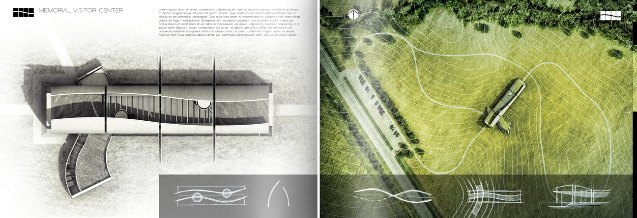
I put some more time into project portfolio upgrade continuing to develop the visitor center pages. The above sheets are a first pass at the layout and will serve as an introduction to the design and concept. Since the relationship to the landscape is such a crucial part of the design, I wanted the look to be bold and stand out in the opening pages. This meant desaturating the facing page and really playing up the color and texture of the site plan itself. Since the original project was designed so long ago,  I had lost most of the information and therefore I had no idea where the exact location of the site was. All I had was an image of one of my old presentation boards. To get around this problem, I took snippets of satellite imagery and combined them together to create the final composition.

hand_drawn_site_plan
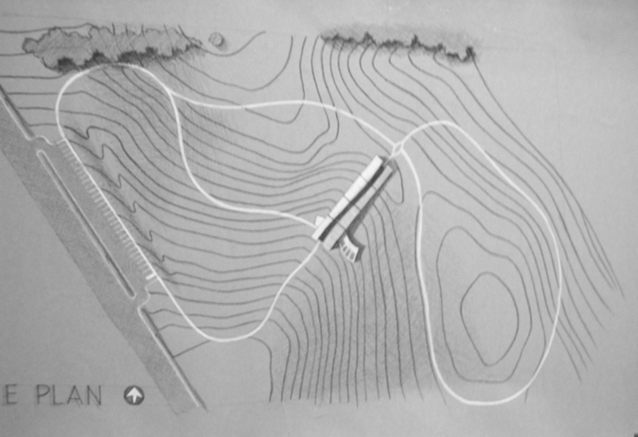
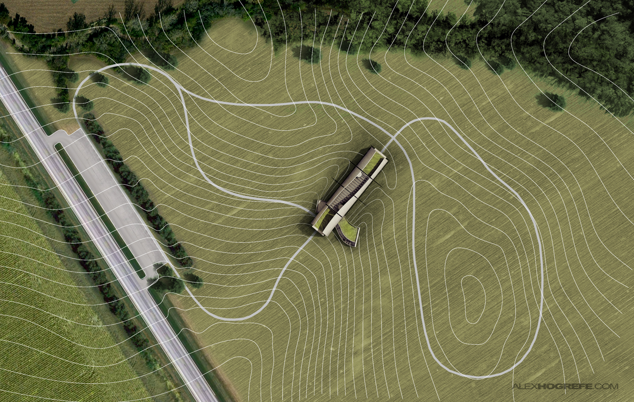
Above is the  hand drawn site plan from the original project. I began by importing the image into AutoCAD and scaling it to the proper size. I then traced the topo lines and exported the line work as a PDF. This gave me a scaled base to work from in Photoshop.


Portfolio_upgrade_Siteplan_textures
I needed some textures and trees and the easiest way for me to find these was to take screen shots of satellite maps. In a matter of minutes, I had a good collection going. Above are the textures that I used in the final composition.


Model
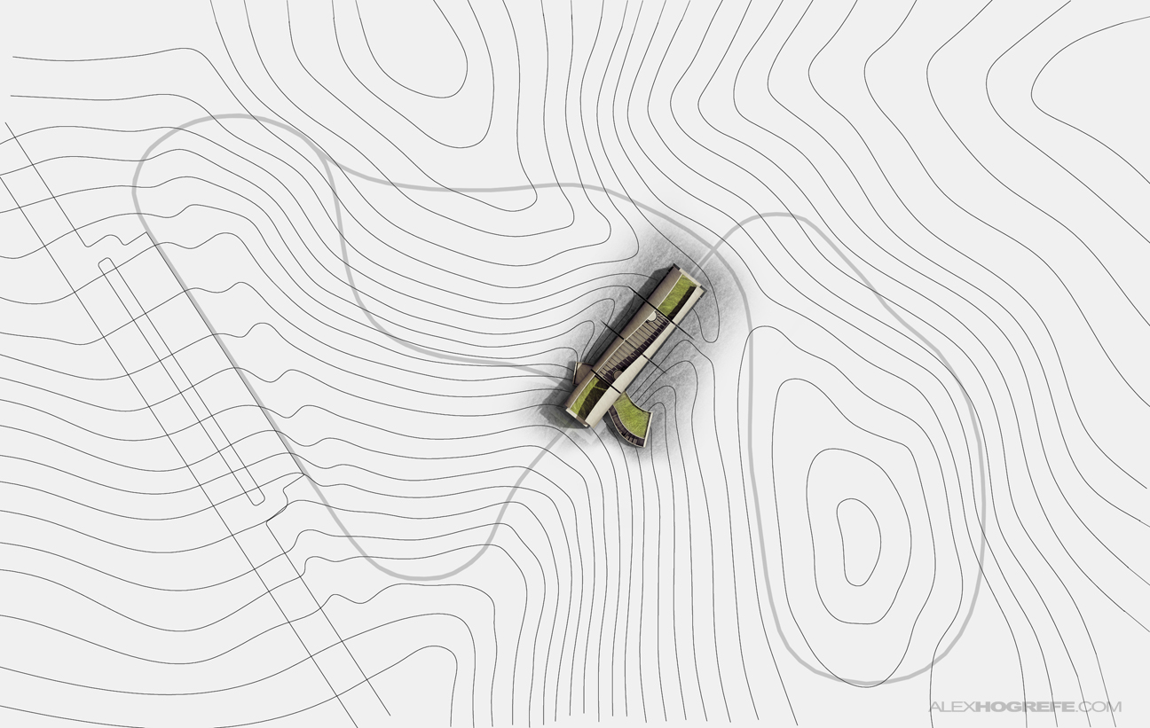
As mentioned above, I began with a PDF of the AutoCAD exported line work. I also used the rendered roof plan from the previous page for the visitor center building.
  
Model
I next started to overlay field textures. The satellite images had lots of brown and red tones. I fixed this by adjusting the Hue and “colorizing” the images. I also inverted the topo lines to give them more contrast with the ground.


Model
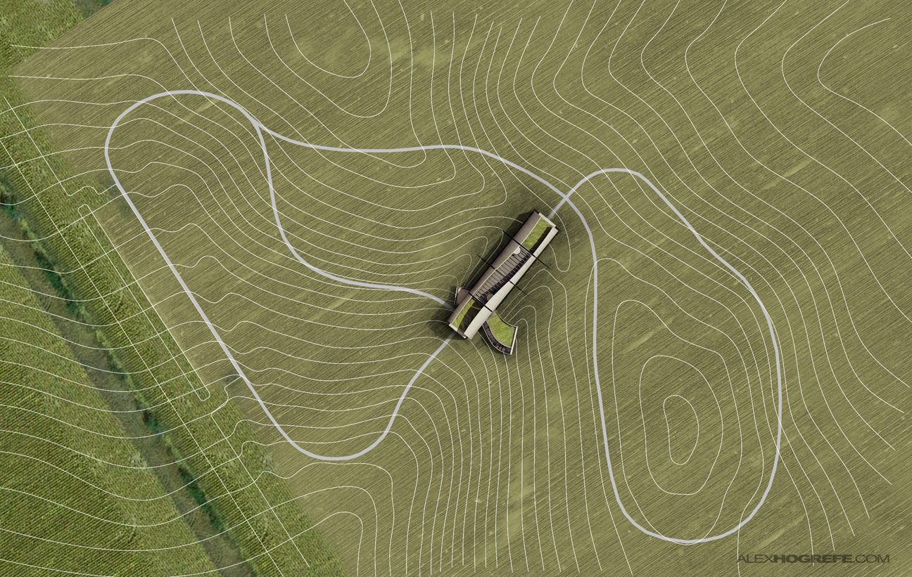
The roads came next.


Model
Then came the trees. I spent very little time actually cutting them out. Since the trees are typically darker than the ground, I just set the layer blend mode to “darken”.


Model
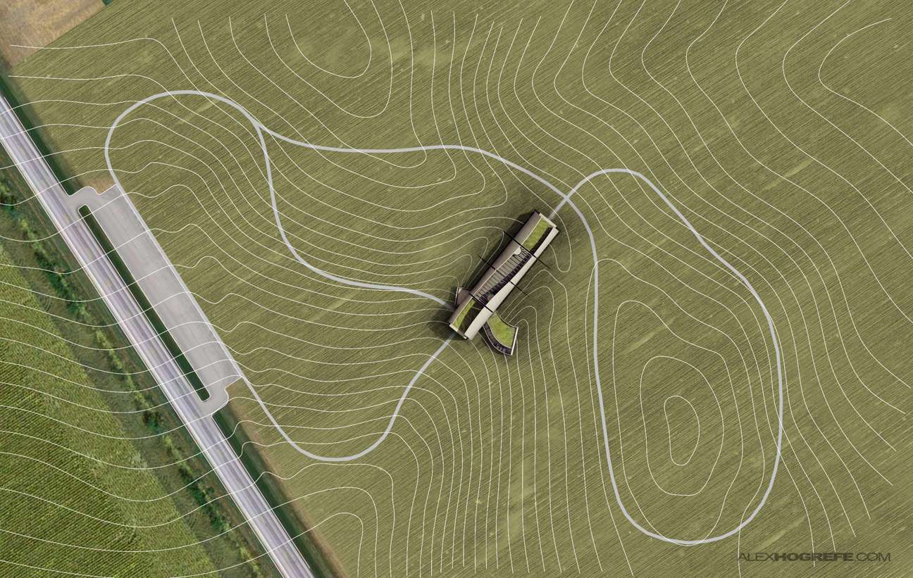
Finally, I did some color correcting and added shadows to play up the topography.
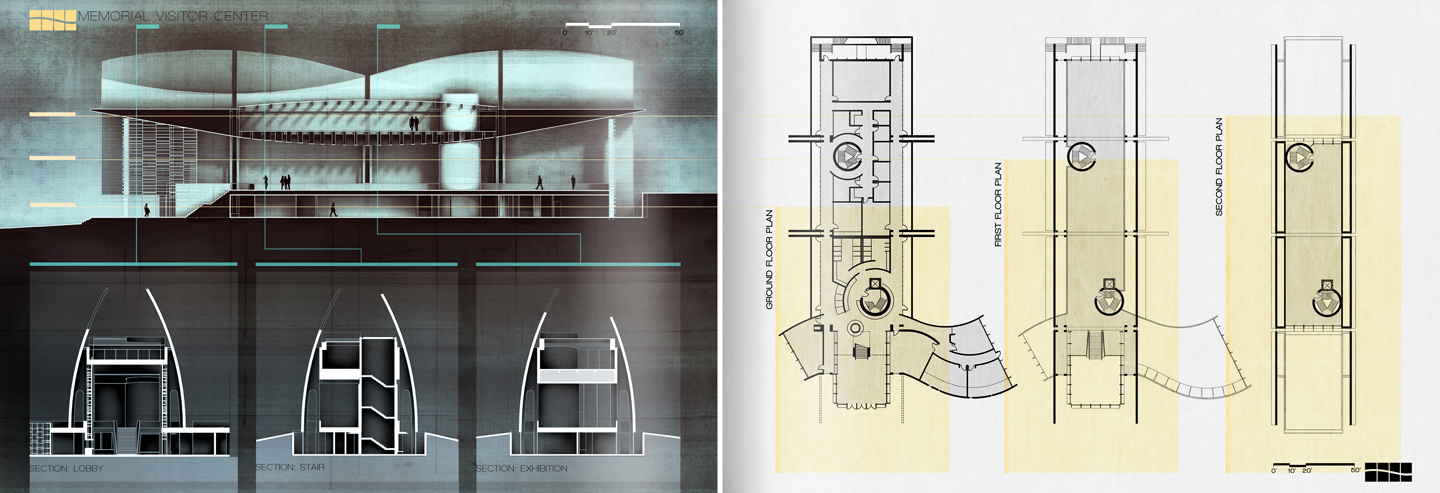
 Below are where things stand at this point. I have three pages started which all still need some tweaking. I am planning two more spreads. One for diagrams and the other for interior/exterior illustrations. More on this later.

final pages 0
final pages 2
final pages 1

Photoshopped Landscape Tutorial

by  | Dec 6, 2010 |

Photoshopped Landscape Tutorial

The illustration in this tutorial was used for a competition that another student, Jeff Kruth, and I worked on a few years ago in grad School. The video explains the work flow used to add tall grass to an otherwise dull Kerkythea rendering. Some important things to pull from this video are how default Photoshop brushes can be used to get rid of the clean edge lines left over from the rendered image. In this case, a default grass brush in Photoshop was used to soften the edges of the landscape. The burn and dodge tools were used to add shadows and highlights to the vegetation.
In order to cut down the length, I didn’t really take my time with the clipping and making selections. Normally, this would be done a little more carefully and precisely. The base rendering isn’t at a very high resolution either. The video moves pretty fast, but there is a lot of information I am trying to fit in a small amount of time. You may have to use the pause button quite a bit.

base_image_alex_hogrefe
(Above) Base Kerkythea rendering with sky and background elements Photoshopped in.


photoshop_landscape_architecture_illustration
(Above) Grasses added through Photoshop.

Adding People Via Photoshop

by  | Nov 10, 2010

Adding People Via Photoshop

I wanted to get in video form, some of the techniques I use to add people into my illustrations. This video outlines 3 situations I run into often including reflective surfaces, typical shadows, and people in motion. The libraries of people don’t always fit the lighting situations in the scene, so the video also describes a way to  add highlights to better integrate people into the scene. There are tons of examples of more artistic ways to add people into an illustration and I have plans to develop some tutorials later on down the road testing out some these techniques.

Advanced Post Production Techniques

Hello 3D artists ! we have today a great tutorial about Advanced Post Production Techniques photoshop and how to improve your render to achieve realism ,
this tutorial was made by http://www.digitalvizstore.com/ and this render just got Vray Workshop TOP5 award !
this tutorial is for free and his length is about 1:24:00 , so sit back and enjoy !


Download 50 lensflares pack for free

Today we have a great lensflares pack made by Shahadat Rahman , in this pack , you will find 50 transparent lens flares than can be used in your projects. Also included is each flare on a black background so you can see what each flare looks like , also a some useful instructions are included on how to use them, those lensflares are free to use in your personal or commercial work , feel free to comment and let us know what do you think.

DOWNLOAD: Free DOWNLOAD